Post by X7[Q2C] on Sept 3, 2009 23:07:06 GMT -5
Peewee's Pipes The Giant Aliens
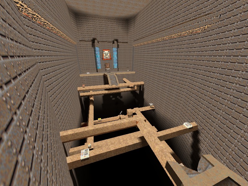
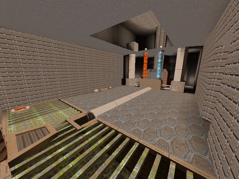
 pwpipes1.bsp

 q2c.tastyspleen.net/maps/con_7/pwpipes1.zip
Judges scores

Judges comments:
James[Q2C]:
I thought it was a pretty cool map, the textures kidna bgged me but an all-around good map.
I Loved the railgun room. i was impressed with the size of the map.
Dervish:
This one reminds me of some of the single player maps in q2, and as such it needs a little more work on the flow for multiplayer. The inability to enter and exit certain areas quickly and with more than a few choices cuts down on the speed of player movement and the flow of the combat.
While some spots are a bit monotonous due to overuse of a single texture, the map is consistent all around in terms of form and style, and theres not a lot of places where you get hung up on brushes.
I found it to be lacking any sounds, where it could have used water effects and pump sounds.
Spawn Girl:
1) Definitely is not for all the levels of skill
2) Is too labyrinthine and have several separated parts and no conectivity (without skill)
I don't like the map is cold, and ugly. Is a good job technically but nothing more.
Can be fun for some jump mod players.
Wixen1 [Q2C]:
n/a
Mr. LemonyFresh:
I find the map to be a little inconsistent and random in it's layout.
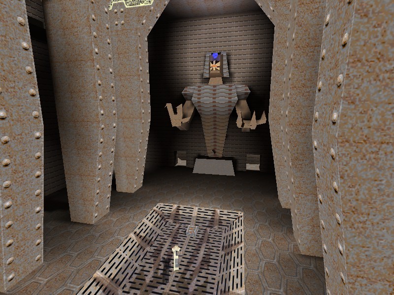
At one point you can find scenery typical to that of an Egyptian theme while at the same time you stumble upon randomness like for example, what looks like some very big ..bunk beads..?
I wouldn't mind, but the transition between techno/Egypt and techno/...?
is kinda fuzzy and I'm not seeing any kind of consistent theme or idea.
The geometry is not bad, I think it could have been a little more carefully put together in some places,
but aside from that, there are some daring efforts like the statue that holds the quad damage.
The texture placement is ok, although a bit of colour coordination would have gone far.
I felt as though some space in the rooms could have been filled up, while some corridors I found a bit claustrophobic.
Apart from some slightly messy brush placement, the tris count for the level is quite stable, and everything runs fine.
I found that some of the platforms and corridors were a tad bit ridged, something needs to give for smoother gameplay.
I quite like the the the BFG is placed, kinda harder to get but obvious that it's there.


 q2c.tastyspleen.net/maps/con_7/pwpipes1.zip


Judges scores

Judges comments:
James[Q2C]:
I thought it was a pretty cool map, the textures kidna bgged me but an all-around good map.
I Loved the railgun room. i was impressed with the size of the map.
Dervish:
This one reminds me of some of the single player maps in q2, and as such it needs a little more work on the flow for multiplayer. The inability to enter and exit certain areas quickly and with more than a few choices cuts down on the speed of player movement and the flow of the combat.
While some spots are a bit monotonous due to overuse of a single texture, the map is consistent all around in terms of form and style, and theres not a lot of places where you get hung up on brushes.
I found it to be lacking any sounds, where it could have used water effects and pump sounds.
Spawn Girl:
1) Definitely is not for all the levels of skill
2) Is too labyrinthine and have several separated parts and no conectivity (without skill)
I don't like the map is cold, and ugly. Is a good job technically but nothing more.
Can be fun for some jump mod players.
Wixen1 [Q2C]:
n/a
Mr. LemonyFresh:
I find the map to be a little inconsistent and random in it's layout.
At one point you can find scenery typical to that of an Egyptian theme while at the same time you stumble upon randomness like for example, what looks like some very big ..bunk beads..?
I wouldn't mind, but the transition between techno/Egypt and techno/...?
is kinda fuzzy and I'm not seeing any kind of consistent theme or idea.
The geometry is not bad, I think it could have been a little more carefully put together in some places,
but aside from that, there are some daring efforts like the statue that holds the quad damage.
The texture placement is ok, although a bit of colour coordination would have gone far.
I felt as though some space in the rooms could have been filled up, while some corridors I found a bit claustrophobic.
Apart from some slightly messy brush placement, the tris count for the level is quite stable, and everything runs fine.
I found that some of the platforms and corridors were a tad bit ridged, something needs to give for smoother gameplay.
I quite like the the the BFG is placed, kinda harder to get but obvious that it's there.


![X7[Q2C] Avatar](http://x7q2c.site90.com/av/x7.gif)


