Post by X7[Q2C] on Sept 3, 2009 23:11:14 GMT -5
Shizznit's Blinged-Out Space Hooptie
 shizz1.bsp

 q2c.tastyspleen.net/maps/con_7/shizz1.zip
Judges scores

Judges comments:
James[Q2C]:
n/a
Dervish:
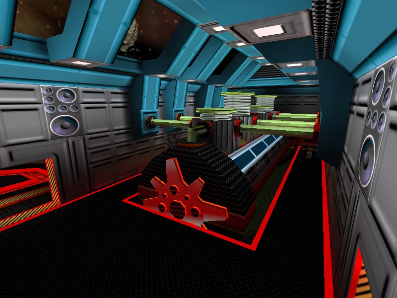
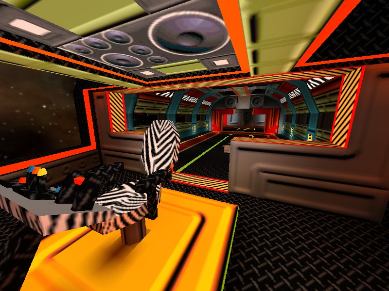
This map is a riot to play. The bumping musical score that changes up throughout the ship as you move is hilarious and the little touches like the huge stereo cabinets and a zebra skin captains chair really help the map live up to it's name.
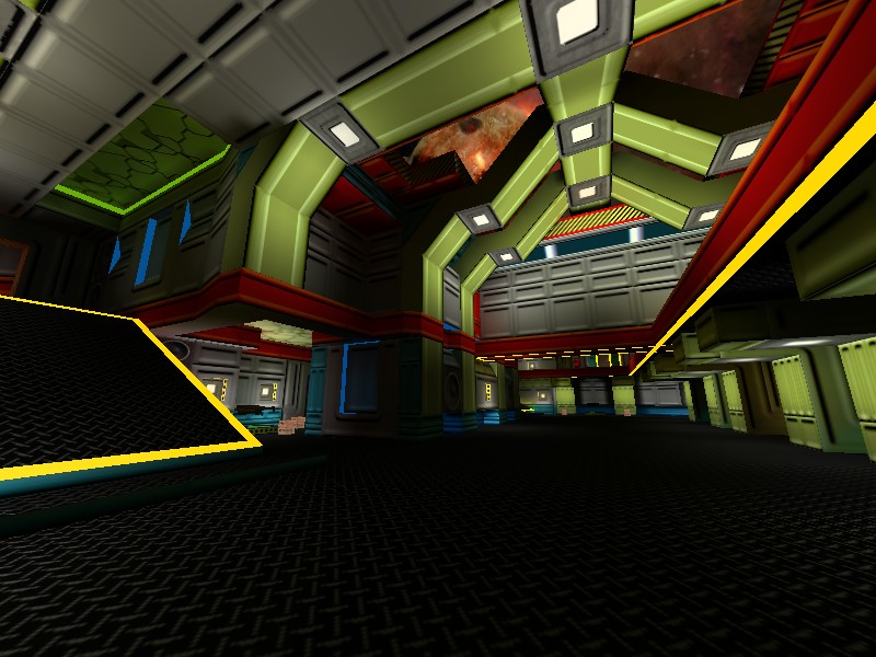
The item placement is very simplistic but it makes for some fun play that admittedly is kinda one dimensional (instagib). The texturing was good and the architecture itself while fairly symmetrical is very interesting and visually pleasing.
The overzealous use of bright colors is enthralling and the big pumping engine room is a thing to behold.
Spawn Girl:
The textures seem plastic.
Maybe was the author idea but, is too much colorfull.
Personaly, i dont like this style of (plastic) textures.
Could be a nice map for childs, for other game maybe mario bros.
However the map have a nice gameplay and conectivity.
And is another meticulous work of marics.
Wixen1 [Q2C]:
n/a
Mr. LemonyFresh:
wow, this is one pimped out space craft . screw deep space exploration, this is deep space partying
I can say with all honesty, that I've never come across a death match like this before, very nice.
I think the music was ok, but i would have liked to see a bit more rhythm.
It really needed a bit more strength and body. It accompanied the theme nicely though.
The colours are pretty extraordinary, you seemed to have made the colour pallet your bitch for this map.
I would have liked a little variety in weapons considering the changing environments, but for the most part, the rail guns suit the style of the map nicely.
Nicely done Shizznit


 q2c.tastyspleen.net/maps/con_7/shizz1.zip


Judges scores

Judges comments:
James[Q2C]:
n/a
Dervish:
This map is a riot to play. The bumping musical score that changes up throughout the ship as you move is hilarious and the little touches like the huge stereo cabinets and a zebra skin captains chair really help the map live up to it's name.
The item placement is very simplistic but it makes for some fun play that admittedly is kinda one dimensional (instagib). The texturing was good and the architecture itself while fairly symmetrical is very interesting and visually pleasing.
The overzealous use of bright colors is enthralling and the big pumping engine room is a thing to behold.
Spawn Girl:
The textures seem plastic.
Maybe was the author idea but, is too much colorfull.
Personaly, i dont like this style of (plastic) textures.
Could be a nice map for childs, for other game maybe mario bros.
However the map have a nice gameplay and conectivity.
And is another meticulous work of marics.
Wixen1 [Q2C]:
n/a
Mr. LemonyFresh:
wow, this is one pimped out space craft
 . screw deep space exploration, this is deep space partying
I can say with all honesty, that I've never come across a death match like this before, very nice.
I think the music was ok, but i would have liked to see a bit more rhythm.
It really needed a bit more strength and body. It accompanied the theme nicely though.
The colours are pretty extraordinary, you seemed to have made the colour pallet your bitch for this map.
I would have liked a little variety in weapons considering the changing environments, but for the most part, the rail guns suit the style of the map nicely.
Nicely done Shizznit


![X7[Q2C] Avatar](http://x7q2c.site90.com/av/x7.gif)


