Null
Gladiator

Posts: 555
|
Post by Null on Apr 7, 2015 20:23:20 GMT -5
|
|
Null
Gladiator
Posts: 555
|
Post by Null on Apr 7, 2015 21:16:04 GMT -5
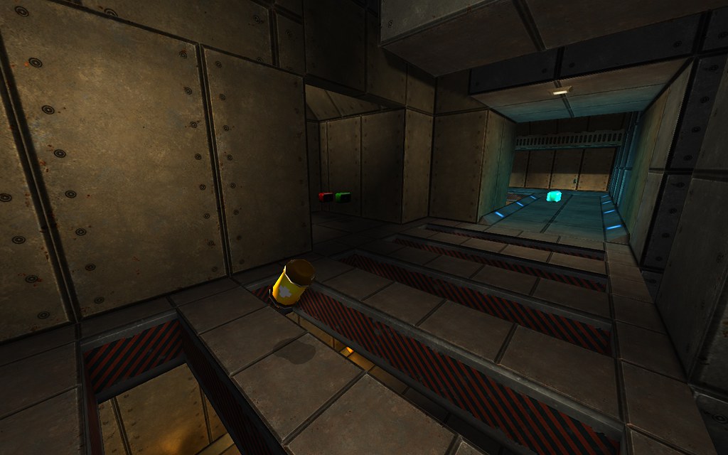
Please post your feedback below. Thank You! spirit2dm3 (my score: 7/10)Nice architecture, some really nice details in areas. Lighting is too bright, almost the sense of being fullbright in areas. The flow is a bit off, didn't feel I could go where I wanted to go, stuck in corridors, long ladders. Suggestions: Adjust the lighting a bit. Create a better flow, connectivity. |
|
|
|
Post by jitspoe on Apr 11, 2015 2:08:51 GMT -5
The lighting seemed a bit bright/bland/uniform in this one. I felt the lava fall was a bit cheesy. The supports around the rock areas were nice -- maybe add a little more variation to the rocks so they look more organic. The texture alignment of the metal above that area kind of bothered me, though -- looked a bit rushed (doesn't line up with the edges of the brushes). The jump pad really looks/feels like it should be a moving platform.
Overall, I feel the map is kind of ... I don't want to say average, but it kinda looks like just another Quake 2 map. It has some nice subtle details, but overall, I don't feel like it stands out from the standard DM maps or what you might see released back in the 90's.
|
|
|
|
Post by cocerello on Apr 12, 2015 12:09:20 GMT -5
For more general details, info on the story behind this and how this information works and how its made, go to:
leray.proboards.com/post/27943/thread
Items found:
One weapon of each kind, except BFG, plus a SG and RL 2x GA, yA, 4x armor shards 2x health packs, 2x large health packs, adrenaline, MH, bandolier, backpack Review:
Solid medium sized base map. Higher than Quake 2 level of brushwork, with several nice bits to add variety (brushes that go out, rotated or/and floating boxes, new teleporters, ... Good texture choices, alignment and use, mainly in a single main color, except some unaligned metal textures on the top of the map. More or less varied layout, variety in rooms with mainly ''corridorish'' rooms and no arena or central room, compact, changes in floors mainly with several ramps or stairs so its hard to define floors and given the number of connections between places, it get even more mixed, with some elevators, ladders and teleporters to spice thing up: to summarize, one could say it has two main floors. Lighting is good, contrasted, with variety, and around q2dm1 indoors in overall brightness or a bit higher. Combats are more horizontal than vertical, and keep a good balance. Looks to be geared toward 4-8 players. Only sounds that could be found were lava running, water running, and a different sound for the teleporters. Looks way better than the screenshots in the work in progress thread, as back then i though it was a bit flat, looked like it had a bit ''newbiesh'' brushwork, and was an advocate or adding another texture with another main color to add something that would stand out, but now i am doubting on that. Has lots of places to move at, places to investigate, the rooms are more or less the same in size, but thave personality enough to differentiate them apart fast and give them names (lava fall's room, slime's room, crates in lava's room, crusher's room, outdoor area, .... The layout is complicated enough but easy to understand. Has lots of nice brushwork details, but some aren't that easy to recognize (teleports and windpads). The textures are well used, and have roles distinctive enough to help the understanding of the map. Colored lighting was used well. Misses a bit some details on floor and ceiling but its OK. The lava fall doesn't look quite good. The selection of sounds is scarce. Suggestions:
- Make the outdoor area at least half a time bigger and spread a bit the items in there, as it feels rather constrained. - Make clearer what the teleporters are, maybe with a light in the middle or an effect/model/sprite. - Add another teleporter, even though i don't think it is needed gameplay and flow wise, two feel alone by themselves. If something new of this size is used, use it at least only once or more than two times. - Make the MH a bit harder to reach. - Add a sound for the crusher. - Put some more sounds in general. 2-3 more target speakers. - I would separate the two large health packs or put a third one.
|
|
spirit
Quake 2 Mapping Club  maps.rcmd.org
Posts: 509
|
Post by spirit on Apr 13, 2015 11:00:16 GMT -5
Great feedback, and I agree with the vast majority of it. Thanks, cocerello!
|
|
jaydolan
Quake 2 Mapping Club
Posts: 161
|
Post by jaydolan on Apr 14, 2015 6:55:18 GMT -5
The lighting seemed a bit bright/bland/uniform in this one. I felt the lava fall was a bit cheesy. The supports around the rock areas were nice -- maybe add a little more variation to the rocks so they look more organic. The texture alignment of the metal above that area kind of bothered me, though -- looked a bit rushed (doesn't line up with the edges of the brushes). The jump pad really looks/feels like it should be a moving platform. Overall, I feel the map is kind of ... I don't want to say average, but it kinda looks like just another Quake 2 map. It has some nice subtle details, but overall, I don't feel like it stands out from the standard DM maps or what you might see released back in the 90's. I'd agree with you on the lighting, and sure, the lava fall could have been a little more interesting. But what's wrong with a Quake2 map looking like a quintessential Quake2 map? Pan's entry also looks straight out of 1998, and like this one, it's actually what I love most about it. Just my $0.02. |
|