Post by X7[Q2C] on Sept 3, 2009 23:06:16 GMT -5
PONDER by macanah using quark
 macdmponder.bsp

 q2c.tastyspleen.net/maps/con_7/macanah-ponder-map.zip
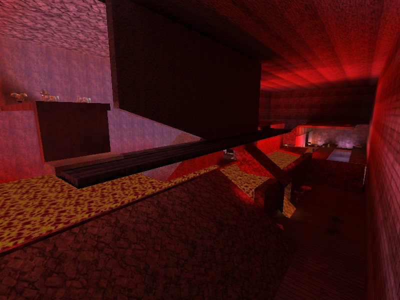
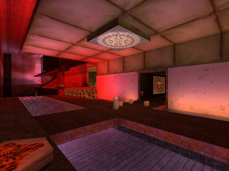
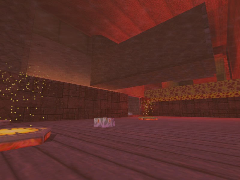
Judges scores

Judges comments:
James[Q2C]:
...
Dervish:
This map reminds me of many experiments that I made when I first began to make maps for q2 and it has many of the visual errors that go hand in hand with this stage in a mapper's development.
I found hall of mirrors effects and strange texture properties in some areas and just very odd architecture in others.
The map does have working teleporters, spawns and some rudimentary item placement, and it is marginally playable, so keep at it on the architecture and spend some time studying other maps to see how mappers use the brushes and their flags to create coherent and beautiful maps.
Spawn Girl:
Nice work.
Is fun structurally, unfortunately something makes that the textures do not form a harmonious environment.
But have some magic in the atmosphere like koth maps maybe.
Wixen1 [Q2C]:
n/a
Mr. LemonyFresh:
Sorry mate, this probably didn't win but it's not the worst by a long shot. ok.
This map has some v-e-r-y basic geometry which i think lost it in terms of visual design.
I think this needed something more visual interesting. I found that the item placement was a little lazy.
For instance, there's a sniper's platformer which is hard to get to if there happens to be a camper on the ledge.
And of course there's the rail gun there as well. I thought you made the special items a bit too easy to find and in the same area as well. Big no-no.
The big open bit needed to be a little less open, I would have liked to see some more obstacles there for the sake of gameplay. Speaking of which, gameplay. that's all this map had to rely on rely, and unfortunately it kinda fell short of that to a degree. It was fairly mediocre.
It wasn't good, but it wasn't bad either. However, if this is an early map, then your doing ok, don't be put off by me .
.


 q2c.tastyspleen.net/maps/con_7/macanah-ponder-map.zip


Judges scores

Judges comments:
James[Q2C]:
...
Dervish:
This map reminds me of many experiments that I made when I first began to make maps for q2 and it has many of the visual errors that go hand in hand with this stage in a mapper's development.
I found hall of mirrors effects and strange texture properties in some areas and just very odd architecture in others.
The map does have working teleporters, spawns and some rudimentary item placement, and it is marginally playable, so keep at it on the architecture and spend some time studying other maps to see how mappers use the brushes and their flags to create coherent and beautiful maps.
Spawn Girl:
Nice work.
Is fun structurally, unfortunately something makes that the textures do not form a harmonious environment.
But have some magic in the atmosphere like koth maps maybe.
Wixen1 [Q2C]:
n/a
Mr. LemonyFresh:
Sorry mate, this probably didn't win
 but it's not the worst by a long shot. ok.
 This map has some v-e-r-y basic geometry which i think lost it in terms of visual design.
I think this needed something more visual interesting. I found that the item placement was a little lazy.
For instance, there's a sniper's platformer which is hard to get to if there happens to be a camper on the ledge.
And of course there's the rail gun there as well. I thought you made the special items a bit too easy to find and in the same area as well. Big no-no.
The big open bit needed to be a little less open, I would have liked to see some more obstacles there for the sake of gameplay. Speaking of which, gameplay. that's all this map had to rely on rely, and unfortunately it kinda fell short of that to a degree. It was fairly mediocre.
It wasn't good, but it wasn't bad either. However, if this is an early map, then your doing ok, don't be put off by me
 .
.


![X7[Q2C] Avatar](http://x7q2c.site90.com/av/x7.gif)


