Post by X7[Q2C] on Sept 3, 2009 23:09:29 GMT -5
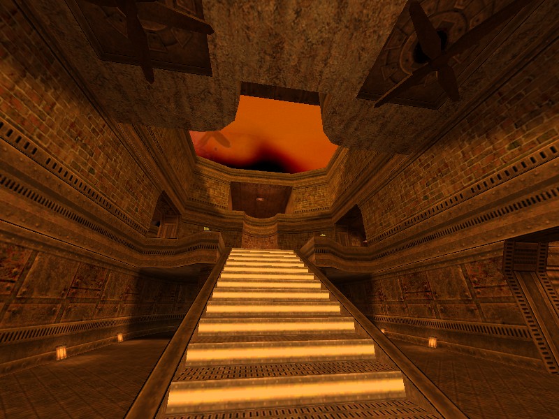
Lost Pillages by Yanick ''tehSandwich'' Letourneau
 tsh2dm1.bsp

 q2c.tastyspleen.net/maps/con_7/tsh2dm1.zip
Judges scores

Judges comments:
James[Q2C]:
n/a
Dervish:
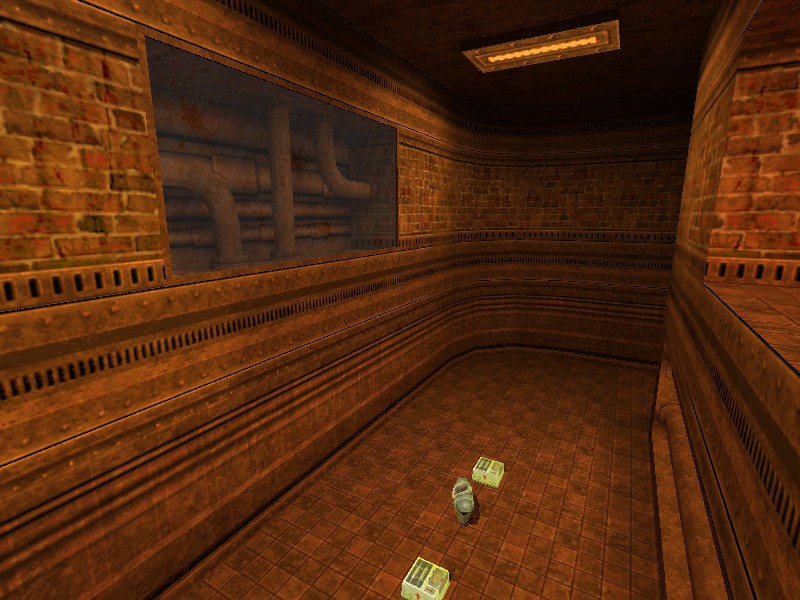
Overall I found this map to be very well made and I enjoyed a lot of the little touches like pumps and crates and barrels that fit the atmosphere perfectly. The usage of this texture set was very well done and if it had not been for the overly sprawling feel of the map I think it would have been a better contender in this contest.
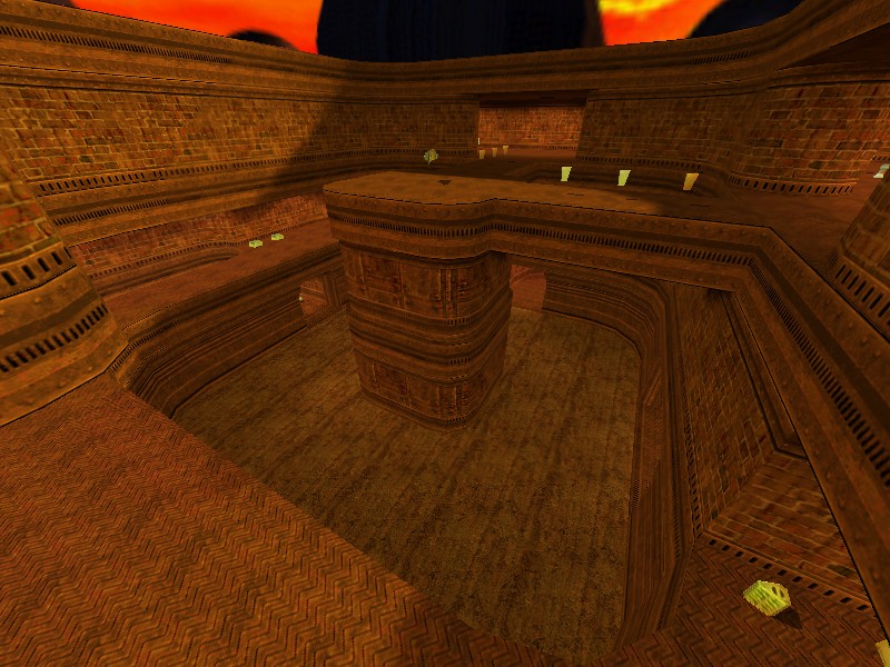
Some of the rooms and scaling just felt a little too big and as such it made it so that items had to be placed quite a ways from each other to affect a real balance, effectively slowing down the gameplay. Still, the rooms are well designed for movement and the curves look very nice while adding a smoothness to the map that many lack.
Spawn Girl:
This map could be a clasic map, even for a tourney with custom maps allowed.
Is a great map. Very fun, and with a cool atmosphere.
Maybe a new and nice sky would be great for this map, and more ammo.
But adding some ammo could be the best map in the contest because the excellent game play.
Unfortunately it is not very original and there are no sounds nor extras.
The gameplay will be similar to "The Edge"
Wixen1 [Q2C]:
n/a
Mr. LemonyFresh:
I didn't have much fun playing on this map.
The massive open areas needed to be not so massive and open, or there needed to be more weapons and obstacles.
In my opinion, just having mini guns and rail guns would have been the way to go. Simply having every weapon doesn't guarantee balanced gameplay.
The other thing was, you had a bit too many armor shards and stimpacks up the top level which makes someone who's been wandering up there a while a pain in the arse to take down, especially with a rail gun, which are important if you want to win.
While the map has an appealing visual design, i wouldn't play this map again because of the weapon placement but also due to the fact that compared to other quake 2 maps, getting around is a real crawl.


 q2c.tastyspleen.net/maps/con_7/tsh2dm1.zip


Judges scores

Judges comments:
James[Q2C]:
n/a
Dervish:
Overall I found this map to be very well made and I enjoyed a lot of the little touches like pumps and crates and barrels that fit the atmosphere perfectly. The usage of this texture set was very well done and if it had not been for the overly sprawling feel of the map I think it would have been a better contender in this contest.
Some of the rooms and scaling just felt a little too big and as such it made it so that items had to be placed quite a ways from each other to affect a real balance, effectively slowing down the gameplay. Still, the rooms are well designed for movement and the curves look very nice while adding a smoothness to the map that many lack.
Spawn Girl:
This map could be a clasic map, even for a tourney with custom maps allowed.
Is a great map. Very fun, and with a cool atmosphere.
Maybe a new and nice sky would be great for this map, and more ammo.
But adding some ammo could be the best map in the contest because the excellent game play.
Unfortunately it is not very original and there are no sounds nor extras.
The gameplay will be similar to "The Edge"
Wixen1 [Q2C]:
n/a
Mr. LemonyFresh:
I didn't have much fun playing on this map.
The massive open areas needed to be not so massive and open, or there needed to be more weapons and obstacles.
In my opinion, just having mini guns and rail guns would have been the way to go. Simply having every weapon doesn't guarantee balanced gameplay.
The other thing was, you had a bit too many armor shards and stimpacks up the top level which makes someone who's been wandering up there a while a pain in the arse to take down, especially with a rail gun, which are important if you want to win.
While the map has an appealing visual design, i wouldn't play this map again because of the weapon placement but also due to the fact that compared to other quake 2 maps, getting around is a real crawl.


![X7[Q2C] Avatar](http://x7q2c.site90.com/av/x7.gif)


