Post by X7[Q2C] on Sept 3, 2009 23:12:48 GMT -5
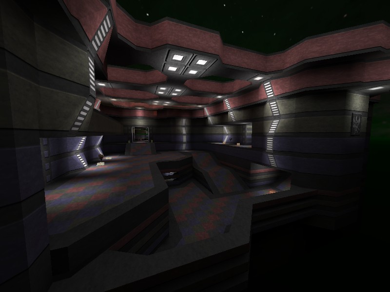
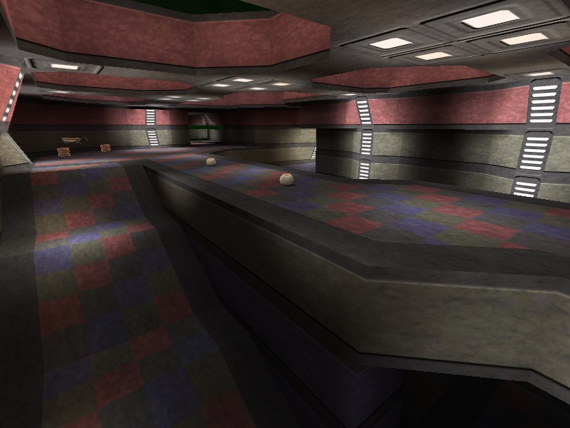
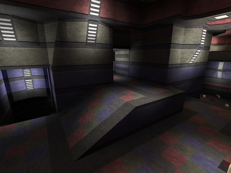
RGB -=-by-=- MONSTER -=DM10=-
 monster10.bsp

 q2c.tastyspleen.net/maps/con_7/monster10.zip
Judges scores

Judges comments:
James[Q2C]:
This is my favorite map sofar.
Dervish:
I really enjoyed this map when I brought it up at work to initially do a walkaround and I did not realize till later when I could play with sound how really unique this map is. The interesting ambient score adds a huge amount of feel to this map.
The layout is fairly simple and the texturing is superior even tho it is a bit simplistic. Some of the wall architecture is really surprising to the eye and the cutout bars between certain areas really create a nice visual effect.
This is a very nice map with a consistent feel and nice flow although the pace of combat can be a little slower than on some smaller maps.
Spawn Girl:
VERY pleasant to the eye and cool game play.
This is the best monster map, lighting creates a excellent atmosphere.
More "Star Trek" than "Star Wars" . But anyway (I love star wars)... COOL MAP
I loved the the linear openings on the walls and the combination with the awesome sky.
Wixen1 [Q2C]:
n/a
Mr. LemonyFresh:
Very impressed with this map.
I'm pleased to see someone breakaway from the typical quake/quake 2 theme of medieval/industrial dark dank and such.
I think you did quite a nice job pulling off the colours considering the colour pallet. Although it seems similar to some of the quake 3 maps I've seen.
The problems I had were of such;
One, I think the weapons were a little too far away from the spawning points, or perhaps you could have made it easier one way or the other for newly spawned players to pick up some hardware before they're melted by shrapnel.
Secondly, I think the sound matched the map to a certain degree, but I don't think it really compliments the blood pumping quake 2 mayhem
Other than that, nice.


 q2c.tastyspleen.net/maps/con_7/monster10.zip


Judges scores

Judges comments:
James[Q2C]:
This is my favorite map sofar.
Dervish:
I really enjoyed this map when I brought it up at work to initially do a walkaround and I did not realize till later when I could play with sound how really unique this map is. The interesting ambient score adds a huge amount of feel to this map.
The layout is fairly simple and the texturing is superior even tho it is a bit simplistic. Some of the wall architecture is really surprising to the eye and the cutout bars between certain areas really create a nice visual effect.
This is a very nice map with a consistent feel and nice flow although the pace of combat can be a little slower than on some smaller maps.
Spawn Girl:
VERY pleasant to the eye and cool game play.
This is the best monster map, lighting creates a excellent atmosphere.
More "Star Trek" than "Star Wars"
 . But anyway (I love star wars)... COOL MAP
I loved the the linear openings on the walls and the combination with the awesome sky.
Wixen1 [Q2C]:
n/a
Mr. LemonyFresh:
Very impressed with this map.
I'm pleased to see someone breakaway from the typical quake/quake 2 theme of medieval/industrial dark dank and such.
I think you did quite a nice job pulling off the colours considering the colour pallet. Although it seems similar to some of the quake 3 maps I've seen.
The problems I had were of such;
One, I think the weapons were a little too far away from the spawning points, or perhaps you could have made it easier one way or the other for newly spawned players to pick up some hardware before they're melted by shrapnel.
Secondly, I think the sound matched the map to a certain degree, but I don't think it really compliments the blood pumping quake 2 mayhem

Other than that, nice.


![X7[Q2C] Avatar](http://x7q2c.site90.com/av/x7.gif)


