|
|
Post by bpulido21 on Jan 15, 2022 15:50:27 GMT -5
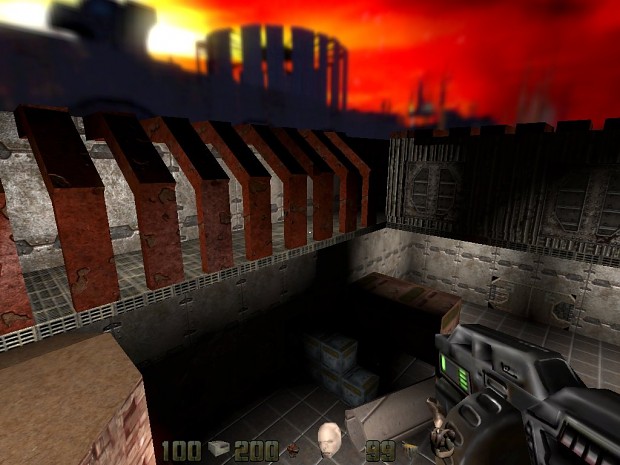
Dispersal facilities mission 15, quake 4 in quake 2 demo map. Map download here:  Dispersal Facilities Dispersal Facilities
 Here is another of the best maps I have made from Quake 4 in Quake 2, so that you can enjoy a little of the work I have done and give me your opinion. Install instructions: Extract the .bsp file to you baseq2/maps directory and load the map by console Write 'map dispersal' and enjoy! KMQUAKE2 OR QUAKE 2 3.24 is Recommended Remember you can request the first unit on my web: themrbenpulidogames.herokuapp.com |
|
|
|
Post by bpulido21 on Jan 17, 2022 8:26:48 GMT -5
A test gameplay of the mission 27 Processing security tower, Quake 4 in Quake 2 gamepack, give me your opinion.  |
|
|
|
Post by bpulido21 on Jan 19, 2022 13:39:16 GMT -5
|
|
|
|
Post by bpulido21 on Jan 22, 2022 21:46:48 GMT -5
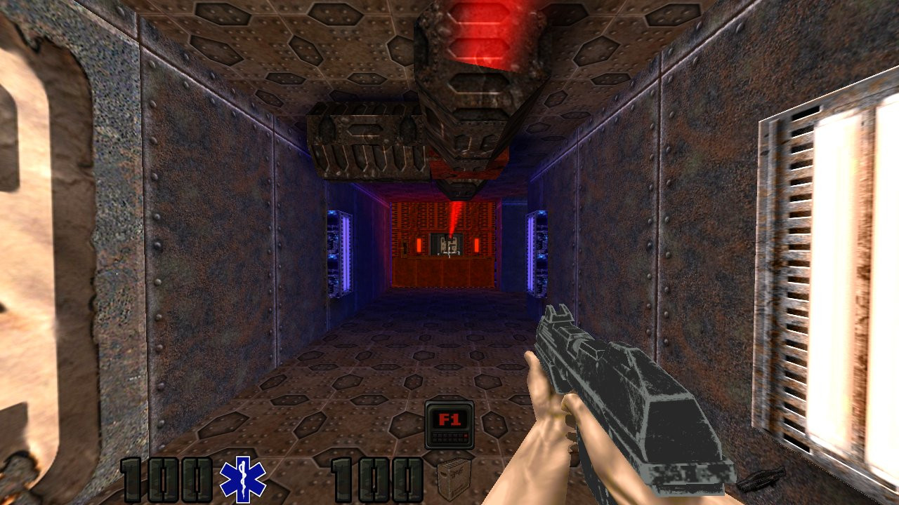
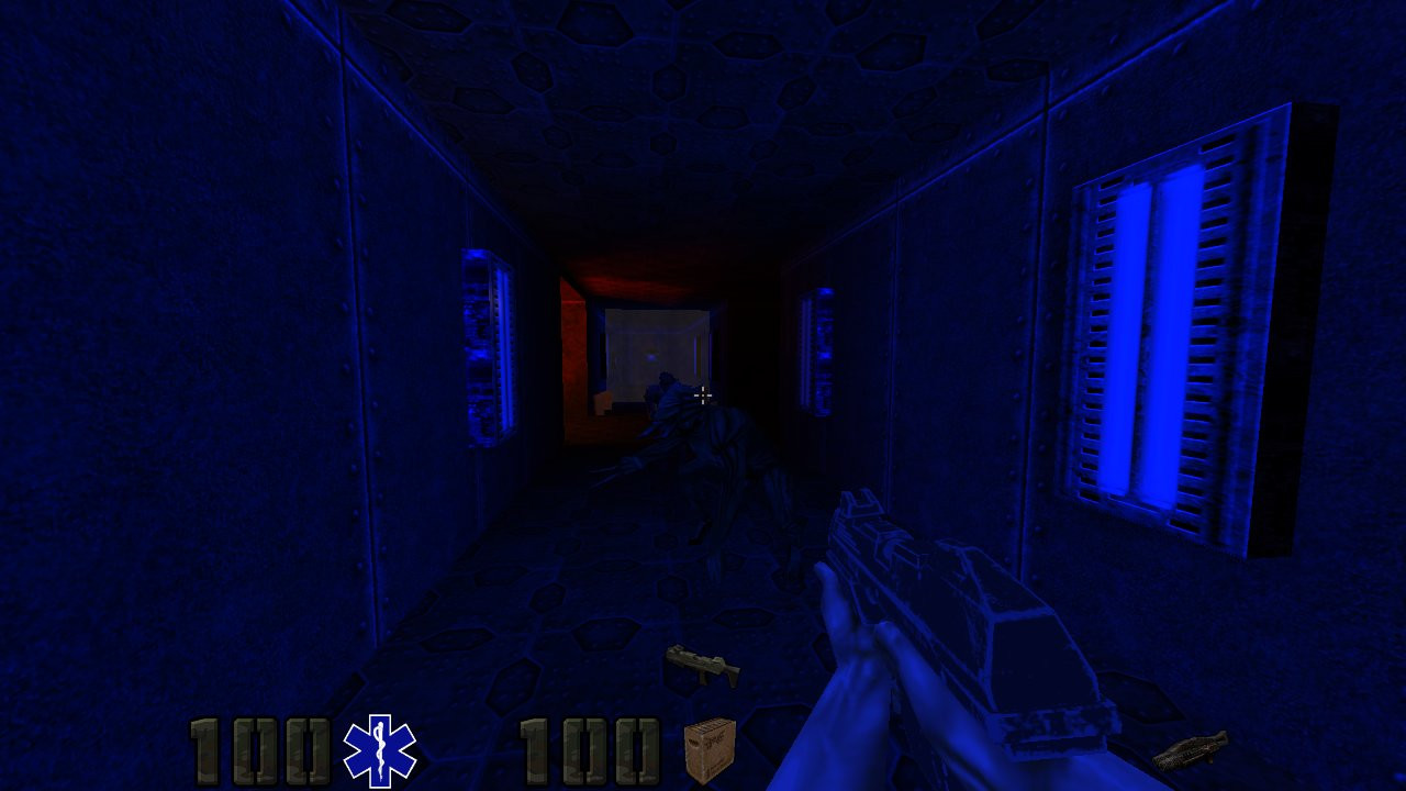
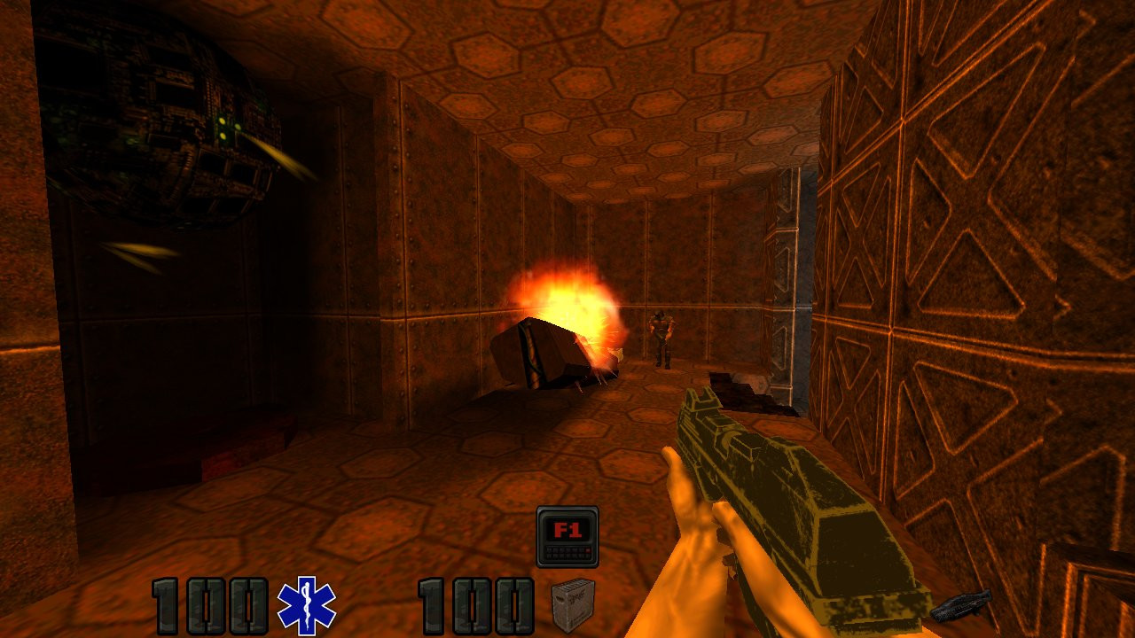
Processing Security Tower mission 27, Quake 4 in Quake 2 full demo map. Mission Objectives:
You must align the data nodes to reach the roof of the tower and disable
the second security station.
This is the last map I upload, you must wait until the beginning of March for the full version to come out. For more experience play the map with The Reckoning Expansion Pack (optional) The file includes: The bsp file that should be extracted to the maps folder of the game. The Quake 3 music for the specific map should be extracted to the game's music folder. Download link: www.moddb.com/mods/quake-4-in-quake-2/downloads/processing-security-tower-mission-27Images:    |
|
|
|
Post by bpulido21 on Jan 23, 2022 13:19:26 GMT -5
|
|
|
|
Post by knightmare on Jan 23, 2022 13:55:12 GMT -5
You can continue to pump out maps like this until you're blue in the face. But as long as they're barely a step or two above Cranky Steve quality, almost nobody will want to play them. As I said in the first thread you started, you need to learn basic Q2 map design with brushes and texturing before you attempt something large and complex. You're using the same wall and floor textures all over the place, without properly aligning them in most cases. Even the ceiling has the same texture as the floor- that's a design no-no in most cases. You're even still building mostly-orthogonal walls and rooms, almost like you're using Qoole as an editor. There's not even a single trapezoidal Strogg door, which is Q2's design trademark. You need to learn brush edge/texture manipulation, and how to design an immersive environment using brush detailing, before you attempt anything ambitious. At this point, it looks like you need to go back to square one and focus on developing basic map design skills. |
|
mikem
Quake 2 Mapping Club   
Posts: 337
|
Post by mikem on Jan 23, 2022 14:35:01 GMT -5
I feel the same way as knightmare. I have no interest in playing your maps because they seem so simple and boring.
The videos are enough for me. First try one single map and gain experience. In a video I saw that you already got good results with map scripting (laser). Try more of it.
|
|
|
|
Post by bpulido21 on Jan 23, 2022 14:35:52 GMT -5
Hi friend, if you don't want to play the maps don't play them. There will be other people who would like to enjoy my maps and I am not charging for it, only accepting donations. The full version will be free for everyone. I also admire you for being the creator of KmQuake2.  |
|
|
|
Post by Guggenheim on Jan 23, 2022 15:30:36 GMT -5
Hi friend, if you don't want to play the maps don't play them. There will be other people who would like to enjoy my maps and I am not charging for it, only accepting donations. The full version will be free for everyone. I also admire you for being the creator of KmQuake2. 
Unfortunately, they are right, architecture is pretty poor, especially nowadays. Maybe try to copy original Q2 style? Q4 remake would look interestind in Q2 style.
|
|
|
|
Post by Guggenheim on Jan 24, 2022 3:26:21 GMT -5
You can continue to pump out maps like this until you're blue in the face. But as long as they're barely a step or two above Cranky Steve quality, almost nobody will want to play them. As I said in the first thread you started, you need to learn basic Q2 map design with brushes and texturing before you attempt something large and complex. You're using the same wall and floor textures all over the place, without properly aligning them in most cases. Even the ceiling has the same texture as the floor- that's a design no-no in most cases. You're even still building mostly-orthogonal walls and rooms, almost like you're using Qoole as an editor. There's not even a single trapezoidal Strogg door, which is Q2's design trademark. You need to learn brush edge/texture manipulation, and how to design an immersive environment using brush detailing, before you attempt anything ambitious. At this point, it looks like you need to go back to square one and focus on developing basic map design skills. It's much better to drink until you're red in face!  |
|
|
|
Post by bpulido21 on Jan 31, 2022 13:03:45 GMT -5
|
|