|
|
Post by Guggenheim on Oct 27, 2021 15:30:29 GMT -5
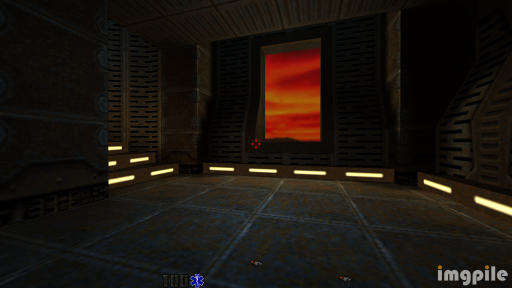
Recently I got really drunk and started making this: 
At first I decided to make a small simple DM map similar to Q3DM1. But now I think that choose of textures was not really successful. Probably I should return to style of my unfinished CTF map.
|
|
|
|
Post by grieve[Q2C] on Oct 28, 2021 6:02:25 GMT -5
 looks okay so far. maybe you let it rest a while, until you got more ideas how to continue.
same style as the CTF - map ? also possible. you should experiment with themes and styles, the more the better !
|
|
|
|
Post by Guggenheim on Dec 2, 2021 9:06:46 GMT -5
A staircase in combined "jail" and "warehouse" style. Which one looks better? That will be probably a part of small 1v1 DM map.
|
|
|
|
Post by grieve[Q2C] on Dec 2, 2021 12:47:41 GMT -5
 I prefer the blue one ....
|
|
mikem
Quake 2 Mapping Club   
Posts: 338
|
Post by mikem on Dec 2, 2021 13:38:53 GMT -5
I think so too.
|
|
|
|
Post by knightmare on Dec 2, 2021 14:59:27 GMT -5
I'd say #3 looks best. #1 looks like the sloped side areas should be for small cargo lits.
The light textures in #2 make the stair risers too bright. Remember, the whole face emits the light, not just the light-looking parts of the texture.
|
|
|
|
Post by Guggenheim on Dec 7, 2021 7:48:43 GMT -5
|
|
|
|
Post by Guggenheim on Dec 7, 2021 7:50:17 GMT -5
Spiral staircase was the hardest part. Is there appropriate plugins for Radiant?
|
|
mikem
Quake 2 Mapping Club   
Posts: 338
|
Post by mikem on Dec 7, 2021 10:50:02 GMT -5
It looks great. Keep up the good work.
|
|
|
|
Post by Guggenheim on Dec 7, 2021 11:11:29 GMT -5
I plan to make a window on my map. Should it be detail? The glass and the frame?  |
|
|
|
Post by knightmare on Dec 7, 2021 11:45:13 GMT -5
If the frame is flush, there's no need. Transparent brushes are already ignored by VIS.
|
|
|
|
Post by Guggenheim on Dec 7, 2021 12:18:53 GMT -5
If the frame is flush, there's no need. Transparent brushes are already ignored by VIS. What it is "flush"? English is not my native language. |
|
|
|
Post by knightmare on Dec 7, 2021 13:07:31 GMT -5
If it doesn't stick out, leave it as structural brushes.
|
|
|
|
Post by Guggenheim on Dec 9, 2021 11:06:06 GMT -5
|
|
|
|
Post by Guggenheim on Dec 9, 2021 11:17:19 GMT -5
Probably, I overused that illumination texture (it's called wslt or so). Just wanted to stick to "Ammo Depot" style.
|
|