|
|
Post by giftmacher on Mar 18, 2015 12:23:20 GMT -5
That shrine + bell looks impossible to pull off in Quake 2  really nice |
|
|
|
Post by newash on Mar 18, 2015 15:17:07 GMT -5
I'm impressed! Whom the bell tolls? Ay!
|
|
|
|
Post by jitspoe on Mar 19, 2015 1:04:53 GMT -5
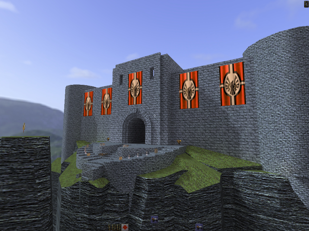
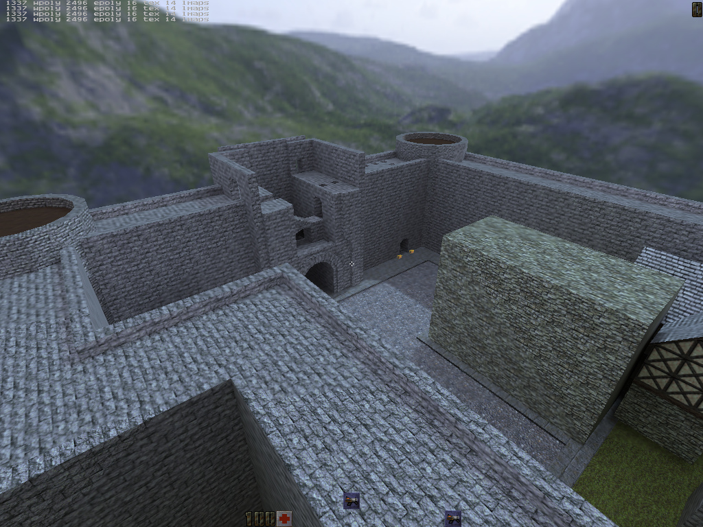
More complete preview of the front of the castle:  Still a lot left to do within the walls, though:  I keep spending time on little details, and not actually finishing the map. Hopefully I can get it done... Hey, at least I have some 1337 r_speeds, though! |
|
Null
Gladiator
  
Posts: 555
|
Post by Null on Mar 19, 2015 3:51:41 GMT -5
Hey, at least I have some 1337 r_speeds, though!  |
|
spirit
Quake 2 Mapping Club    maps.rcmd.org
Posts: 509
|
Post by spirit on Mar 19, 2015 4:43:53 GMT -5
Maybe this is because I'm from Germany, but those large red-black-white flags make the whole castle look like some Nazi-hideout for me. I would suggest removing them, I liked it better without them.
The rest looks very cool, especially that wooden hut with the large bell!
|
|
|
|
Post by newash on Mar 19, 2015 16:10:58 GMT -5
Agree with spirit! Remove tha flag, doesnt match.
|
|
|
|
Post by jitspoe on Mar 19, 2015 22:18:06 GMT -5
----- Light World -----
0...1...2...3...4...5...6...7...8...9... (195)
0...1...2...3...4...5...6...7...8...9... (63)
0...1...2...3...4...5...6...7...8...9.
************ ERROR ************
************ ERROR ************
trian->numpoints == MAX_TRI_POINTS
trian->numpoints == MAX_TRI_POINTS
Argh! Too bad it doesn't give me a brush number or something to make stuff like this easier to track down... ah, the joys of trying to push the limits.
As for the flags... hmm... I thought they looked nice, and the old walls looked kind of bland in comparison. Shame I can't use a different model or texture on them and still get the animated effect. I do have a crazy idea for something to replace them, though, but I don't know that I'll have enough time to do it.
|
|
|
|
Post by cocerello on Mar 20, 2015 4:16:51 GMT -5
Yeah, you definitely need something on those walls if you remove the flags, even now with them on those walls still look a bit flat. You could take out some of the stone blocks, or make some simulated windows (they don't go anywhere but as they are high no one will notice it. Probably the best option is put some brush that goes out from the wall, so you have the brush and the shadow that it cast to add detail for the wall.
|
|
jaydolan
Quake 2 Mapping Club   
Posts: 161
|
Post by jaydolan on Mar 20, 2015 7:08:38 GMT -5
I think those castle walls are just begging for the Dopefish texture  |
|
|
|
Post by jitspoe on Mar 21, 2015 3:57:19 GMT -5
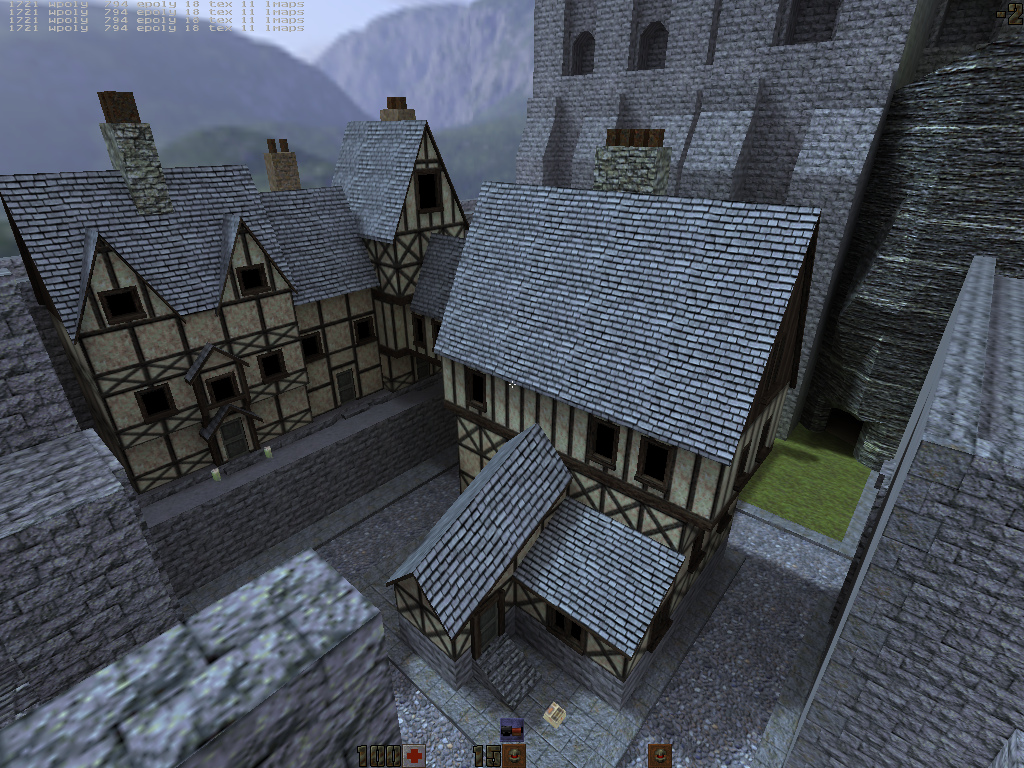
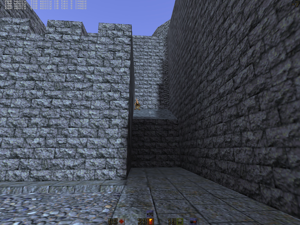
 Gah, so much work to make all these buildings! What was I thinking, putting it off until the last minute? I slept through my alarm and ended up going into work at noon Friday. Oops. And then, when you're working in the wee hours of the morning, thinking you're all alone in your test map, you turn the corner and...  There he is! Crouched there, waiting to blast your face off! Only it's not actually another player. It's just your own corpse from a previous life. Yeah, I about gave myself heart failure the other night... need to get some sleep. |
|
Null
Gladiator
  
Posts: 555
|
Post by Null on Mar 21, 2015 4:17:26 GMT -5
You're never alone, not even at night when channeling some creative spirit! Indeed you gave it your all! In the past life you could have been a knight, with vivid visions returning to claim the throne. That's not just a lifeless corpse, but part of your soul imprinted in this map, perhaps even a ghost trapped in the dungeon lol. When you play this you just know you're stepping into jitspoe's medieval world of awesome. You've done very well. Now you deserve lots of rest, to recuperate all that creative energy. As soon as people start playing this, naturally you'll start feeling it all flowing back to you 10 fold  |
|
Null
Gladiator
  
Posts: 555
|
Post by Null on Mar 25, 2015 21:18:52 GMT -5
Since you considered working on this map after the contest, I was able to get you some feedback from various players on my server. They all love your map, but they have a couple feature requests. They'd like more of the buildings hollowed out, so they can go inside and shoot from the windows or doors. Some also wanted a ladder, rope or elevator to take them to the top of the castle. Lastly a bunch of the players felt that the castle walls needed a wider variety of textures especially on top of the walkway, to defuse the blue/gray brick texture. I guess same thing goes for the rock walls, which are a bit monotone. Overall this is a stunning map and a lot of fun to play, so well done. We would appreciate continued work on it even after the contest, and maybe even variations  |
|
|
|
Post by cocerello on Mar 27, 2015 9:04:59 GMT -5
Could be a good idea, getting feedback from the judges, as a reward for the mappers and so their mood improve for mapping. Just 3 or 4 lines per judge just like you did now. That can be good for the mapper also to improve, no matter if the comment are possitive or negative, and no matter if he/she is going to work on the contest's maps or not, as any advice, can work for future maps.
|
|
Null
Gladiator
  
Posts: 555
|
Post by Null on Mar 27, 2015 21:16:20 GMT -5
Yes this is a good idea. I guess we wouldn't want to leave any of the maps in rough shape if something can be done to improve them. As the organizer of this contest, I'll not actually be rating the maps themselves, but I will provide general feedback at the end. I've also asked all the judges to provide a short write up for map improvements, so hopefully the mappers will use this feedback to learn something, and possibly even fix their maps after the contest. You can find your suggestion here  leray.proboards.com/thread/3680/judges-whove-submitted-scoresheets leray.proboards.com/thread/3680/judges-whove-submitted-scoresheets |
|
|
|
Post by draxi on Mar 17, 2018 4:58:40 GMT -5
Was this map ever released?  |
|